Images, Figures, and Medium Zoom
This is an example post with image galleries. All images in as-folio posts are click-to-zoom by default via medium-zoom — click any image below to see it open full-screen.
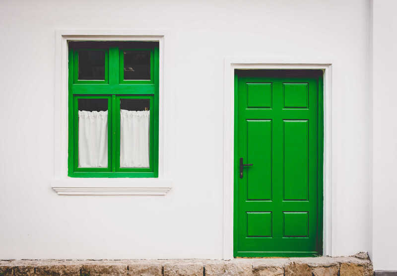
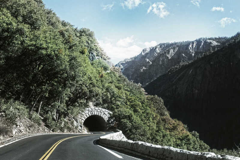
Simple row of images


A simple, elegant caption looks good between image rows, after each row, or doesn’t have to be there at all.
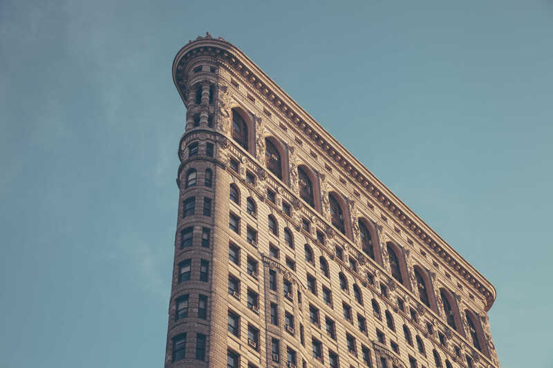
Image rows
Click any image to zoom in — all Figure components are zoomable by default.
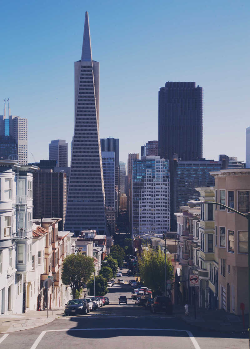

Mixed-width grid (2/3 + 1/3)
You can also have artistically styled 2/3 + 1/3 images:
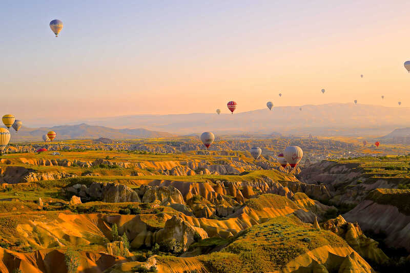
Three-column grid

Caption photos easily. Three equal-width columns using col-sm.
Full-width image

Using the Figure component
The Figure component mirrors al-folio’s figure.liquid interface. All figures are zoomable by default — pass zoomable={false} to opt out:
import Figure from '@components/Figure.astro';

{/* zoomable by default */}
<Figure path="/assets/img/1.jpg" class="img-fluid z-depth-1 rounded" />
<Figure
  path="/assets/img/2.jpg"
  class="img-fluid z-depth-1 rounded"
  caption="My caption"
/>

{/* opt out of zoom */}
<Figure path="/assets/img/icon.png" class="img-fluid" zoomable={false} />
Available props: path, class, zoomable, caption, alt, title, loading, width, height.
Standard Markdown images
Standard Markdown images are also zoomable automatically:
To disable zoom on a specific image, add the no-zoom class:
<img src="/assets/img/icon.png" alt="Small icon" class="no-zoom" width="32" />Tips
- Keep source images ≤ 2 MB for best performance.
- Always write descriptive
alttext — it improves accessibility and search indexing. - The medium-zoom overlay respects dark mode: the background renders well in both themes.